Designing the Sage official blog
Sage is the largest technology company in the U.K. and needed to launch a new financially focused blog that streamlined their digital presence enabling them to generate organic leads via content. The aim was to create an industry leading content experience suitable for global markets in all languages that provided real user value and generated new sources of revenue through customer acquisition.
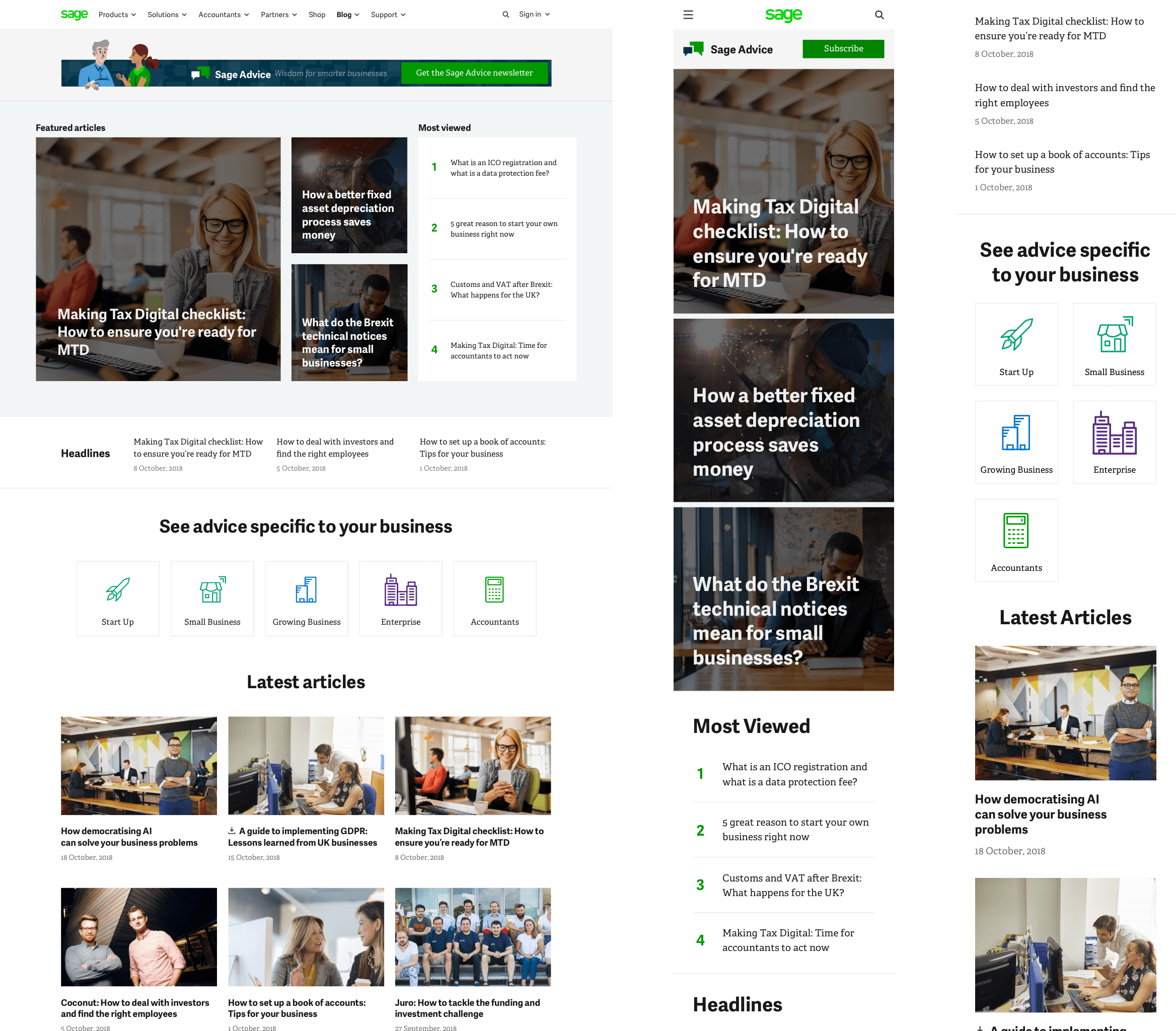
I worked closely with Sage to ensure the content structure was based on their intended target audience. From this I was able to intuitively design the experience for each audience creating opportunity for more personalised, engaging content.
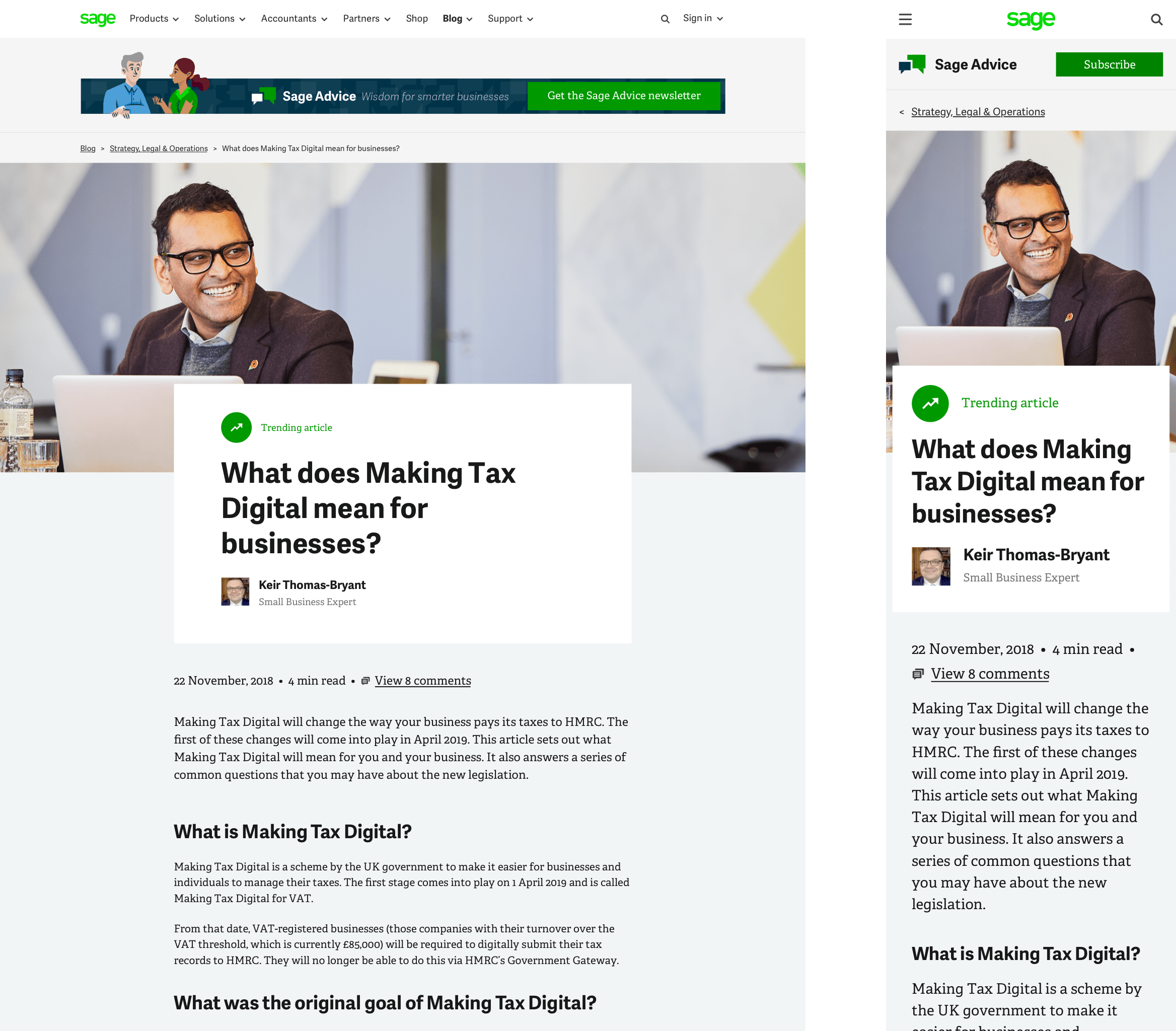
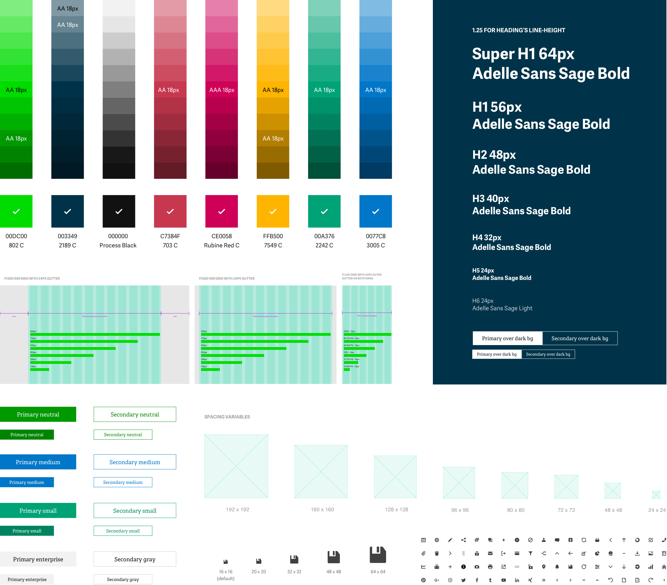
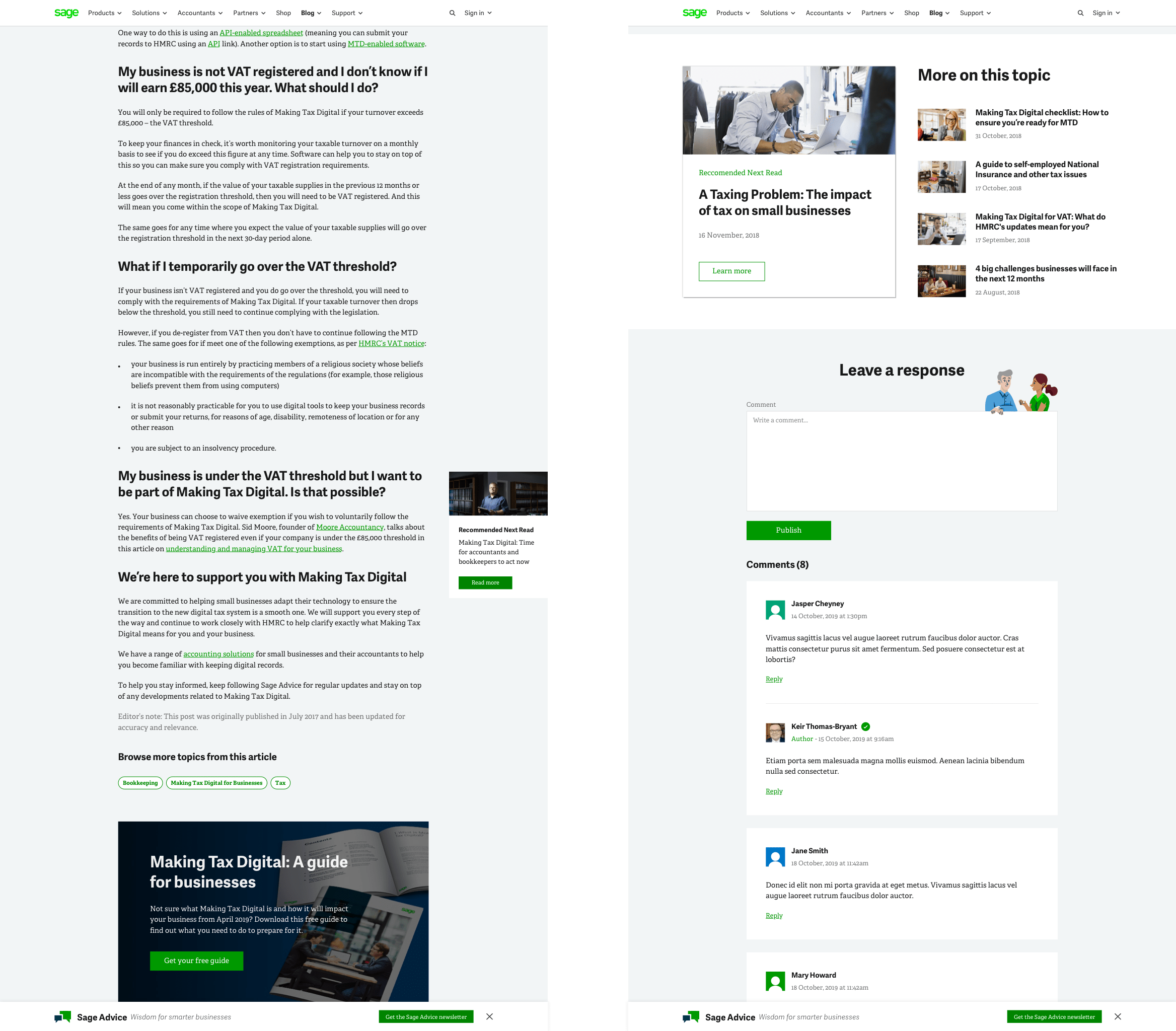
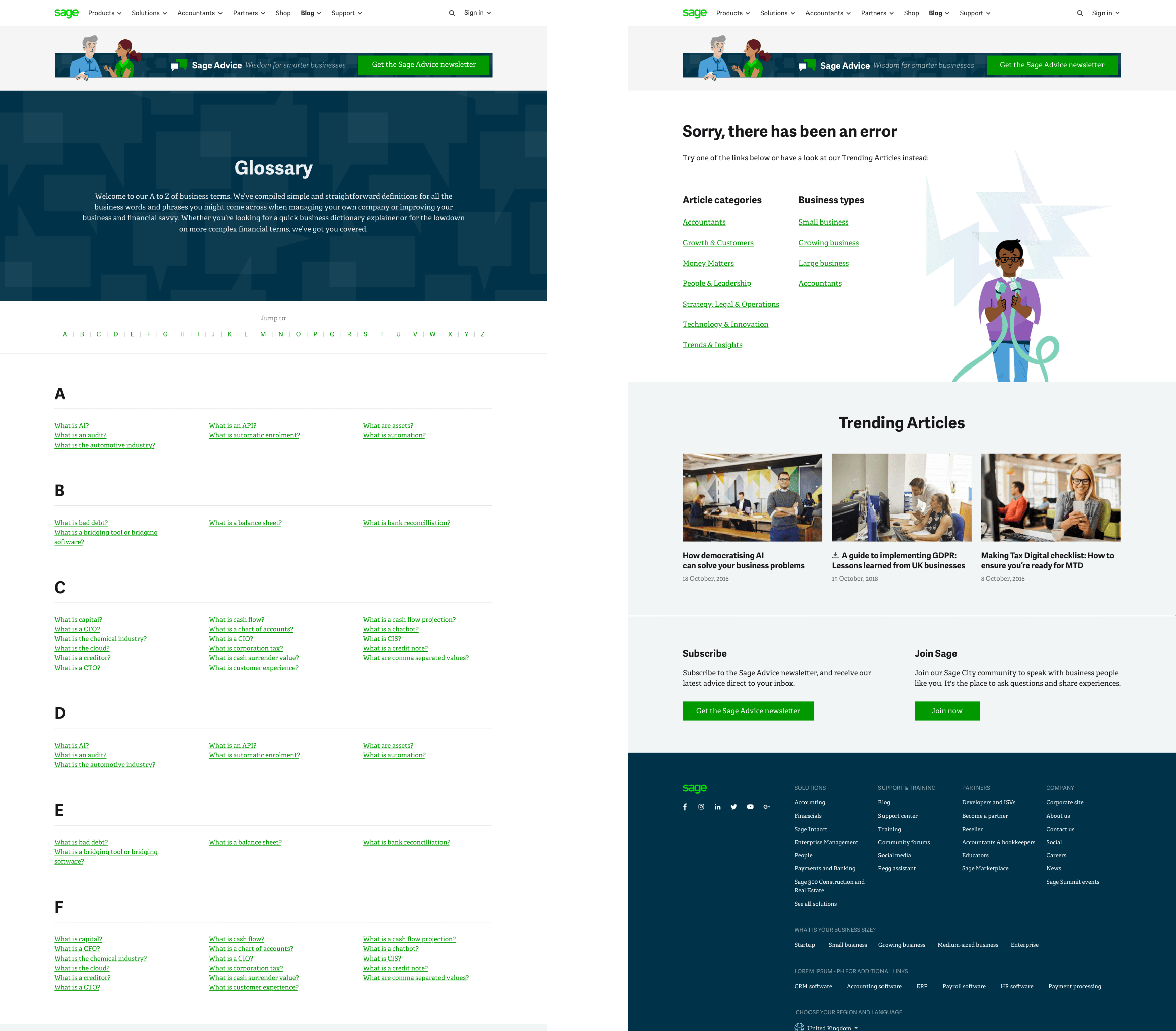
During the project I placed emphasis on designing a focused, distraction-free reading experience that also effectively generated leads. I applied a number of design solutions including optimal line length for reading (50-60 characters per line), accessible colour contrast (AA) and intelligent interaction design delivering lead capture throughout the user journey.
Throughout and after the project I worked side by side with our in house engineering team and Sage senior stakeholders to design, animate and then iterate and test numerous solutions to optimise the websites lead performance and user experience. Data led design allowed us to make informed decisions on which approach was best for the user experience and the business goals.
While collaborating with the Sage.com brand team I worked heavily on developing and contributing towards a new Design System that allowed us to work simultaneously on different aspects of the Sage offering and remain completely consistent. This required refactoring and iterating the visual style to ensure the experience was both faithful with the brand and fit for the users.
Over 4.7m organic sessions in 2019
Generates 35,000 new subscribers each year
Conversion rate increased by over 300%
Launched in 20 markets, in 7 different languages
Did you enjoy this case study? Let me know
