Designing Bravo's online product and brand
Bravo offers private airport transfers directly from local taxi companies, avoiding middleman fees allowing them to keep their prices low. The goal was to create a (light) brand that felt like it was always part of the travel industry in order to gain consumer trust, but with a premium edge.
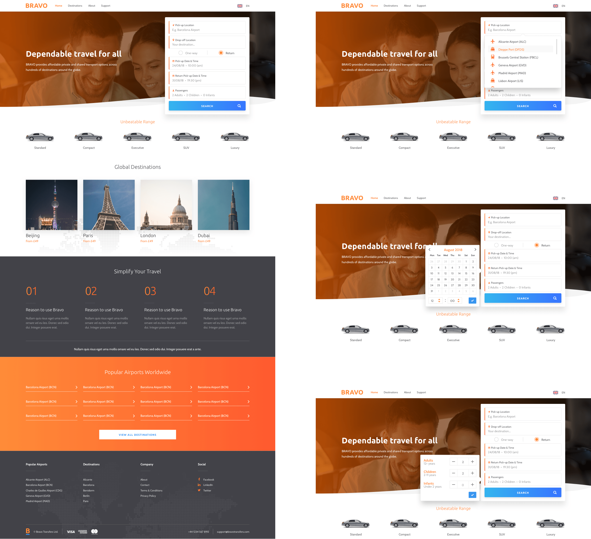
During the branding, bright 'holiday colours' became the focal point to establish familiarity of the brand amongst its competitors but with use of colour gradients, car-based shapes and dark themes it allowed the experience to feel unique and premium.
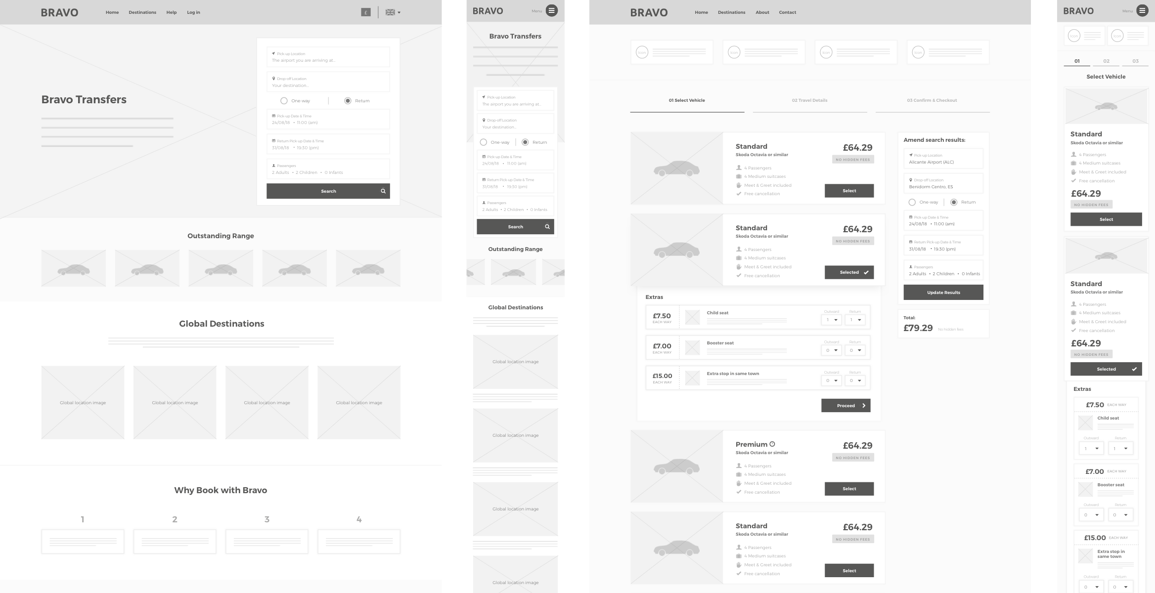
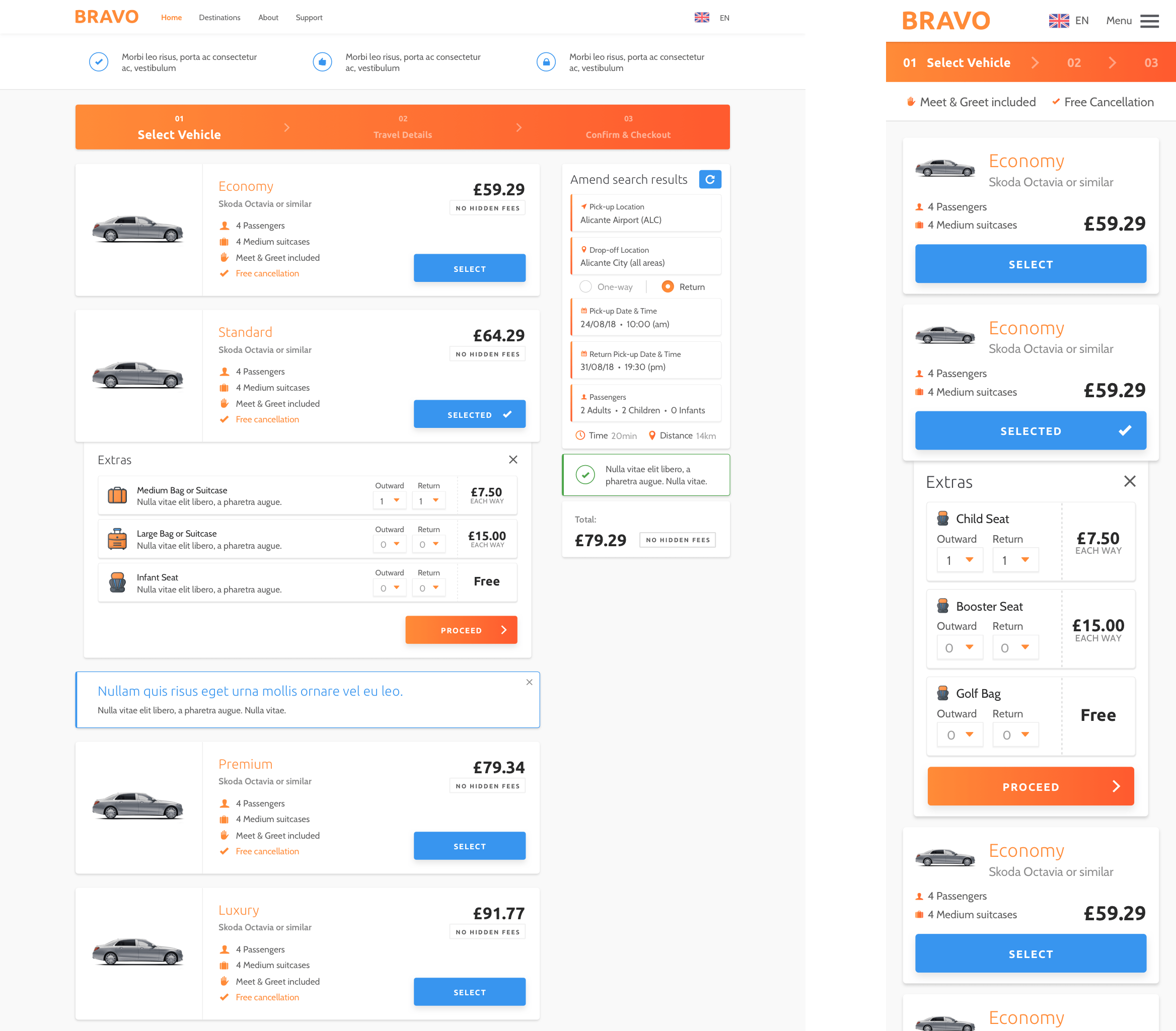
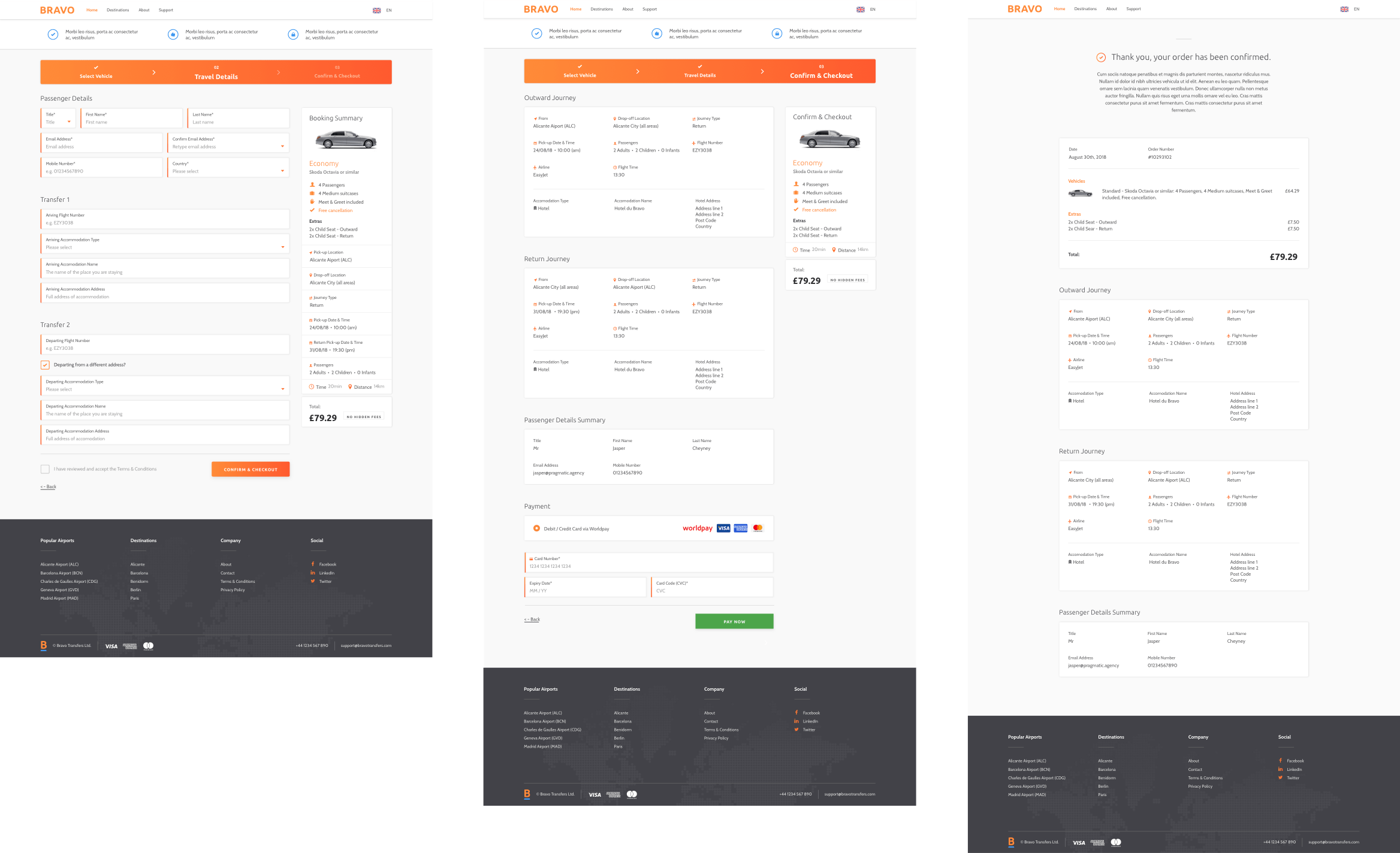
A large part of the project was creating a high performance e-commerce user experience that encouraged up-selling and conversion whilst still feeling intuitive to use on all devices; mindful to avoid the confusion that comes with products involving multiple pick-ups and drop-offs.
When designing the concepts I wanted to focus on making the core user interface as minimal and aesthetically pleasing as possible. Giving careful treatment to the information-dense checkout experience and search fields (quantity, date pickers). This was combined with the application of interaction design which automatically opened the following field when the previous was completed, subtly pushing users through the journey.
Ridesharing and transfer platform successfully operating in all major European countries
Did you enjoy this case study? Let me know
